Which Latency Numbers Truly Reflect User Experience

Measuring software speed is easy to over-simplify. A team reports an average response time, celebrates a lower number after a release, and assumes users feel faster. In practice, averages flatten the experiences that matter most: the occasional request that takes eight seconds, the page that stalls on a weak connection, or the interaction that becomes sluggish only under load. Choosing better numbers is a core part of performance tuning because it directs attention toward delay as people actually encounter it.
Start with the user journey, not the server
A latency metric is meaningful only when it maps to a task someone is trying to complete. Begin by listing the moments that define the journey: opening the app, seeing the first useful content, submitting a form, receiving search results, completing a payment, or exporting a report. Each moment has a beginning and an end that users can perceive. Measure those boundaries rather than a convenient internal step.
This shift changes the question from “How fast is the API?” to “How long does it take before the screen shows the answer?” The difference matters because network time, rendering, hydration, third-party scripts, and backend processing all contribute to perceived speed. A fast endpoint can still sit behind a slow page if the browser waits for unrelated work before displaying anything useful.
Replace the average with percentiles
Averages are useful for rough capacity discussions, but they hide variation. If half of the requests finish in 100 milliseconds and one in twenty takes six seconds, the average may still look respectable while a significant group of users experiences a serious delay. Percentiles expose that spread.
Common choices are the median, the 95th percentile, and the 99th percentile. The median (p50) describes the typical interaction. The 95th percentile (p95) shows what a large minority encounters. The 99th percentile (p99) surfaces rare but painful cases that often affect the users you least want to frustrate, such as customers completing a purchase or administrators saving critical changes.
No single percentile is sufficient. Report at least p50, p95, and p99 together, and keep the unit and time window consistent. A p99 calculated over one minute can be noisy; a p99 over a day may hide a brief outage. Choose windows that match how you operate and how users experience the service.
Match the metric to the interaction
- Navigation and first impression: use time to first byte, first contentful paint, and largest contentful paint to understand when useful content appears.
- Direct manipulation: track input latency and frame timing for actions such as dragging, scrolling, or typing, where a delay of a few frames is noticeable.
- Requests and workflows: measure end-to-end duration from the user action to the visible result, including retries and queued work.
- Background work: record queue time and completion time separately so a fast worker does not conceal a long wait for execution.
Separate perceived speed from infrastructure speed
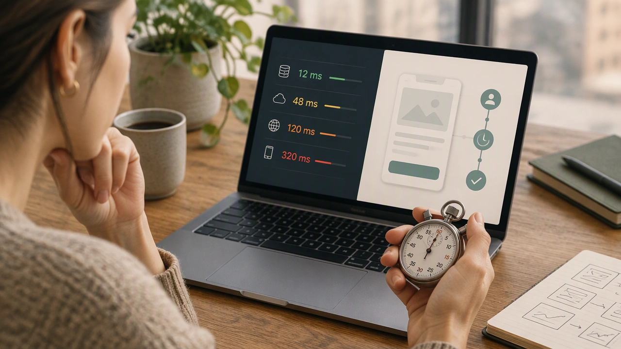
Backend duration is important, but it is only one component. A request may reach the database in 40 milliseconds, then wait for serialization, connection pooling, a content delivery network, browser rendering, and client-side JavaScript before the user sees an update. Instrument each boundary so you can tell whether a regression comes from the service, the network, or the interface.
Client-side measurements are especially valuable because they reflect the environment users bring: mobile devices, variable bandwidth, battery-saving modes, and background processes. Combine laboratory measurements, which are repeatable, with field measurements, which are realistic. Laboratory tests help isolate a change; field data tells you whether that change improved life for actual users.
Use distributions, not isolated numbers
A single number becomes misleading when traffic changes. A p95 of 400 milliseconds may be acceptable during quiet hours and unacceptable during a campaign. Keep the full distribution available through histograms or heat maps, and compare like with like: the same endpoint, route, device class, region, and release.
Segmentation prevents averages from hiding problems. A checkout path may be fast on desktop and slow on older phones. Search may be quick in one region and delayed in another. When you slice by meaningful dimensions, you can identify whether the fix belongs in the application, the network, or the deployment configuration.
Connect metrics to outcomes
Latency is not valuable in isolation. Tie it to outcomes such as task completion, error rate, abandonment, support contacts, and conversion. If a faster p75 correlates with fewer failed submissions, you have evidence that the metric reflects user experience. If a backend improvement does not change the visible result, the bottleneck lies elsewhere.
Set targets with context. A target of “under 200 milliseconds” is incomplete without naming the interaction, the percentile, the device class, and the acceptable error budget. Targets should be stable enough to guide decisions and flexible enough to accommodate legitimate variation.
Build a practical measurement loop
Choose a small set of journey-level metrics, record p50, p95, and p99, and publish them next to release notes. Add traces for the slow tail so engineers can see which span contributes most. Review regressions with the same discipline used for errors: identify the affected segment, reproduce the conditions, change one variable, and verify the result in both laboratory and field data.
The goal is not to collect every possible timing. It is to select numbers that answer the question users implicitly ask: “Did this work when I needed it?” When your latency metrics follow real journeys, expose the tail, and connect to outcomes, performance tuning becomes a focused practice rather than a hunt for a prettier average.